TARA.AI CASESTUDY
Turning Clicks to Customers
Overview
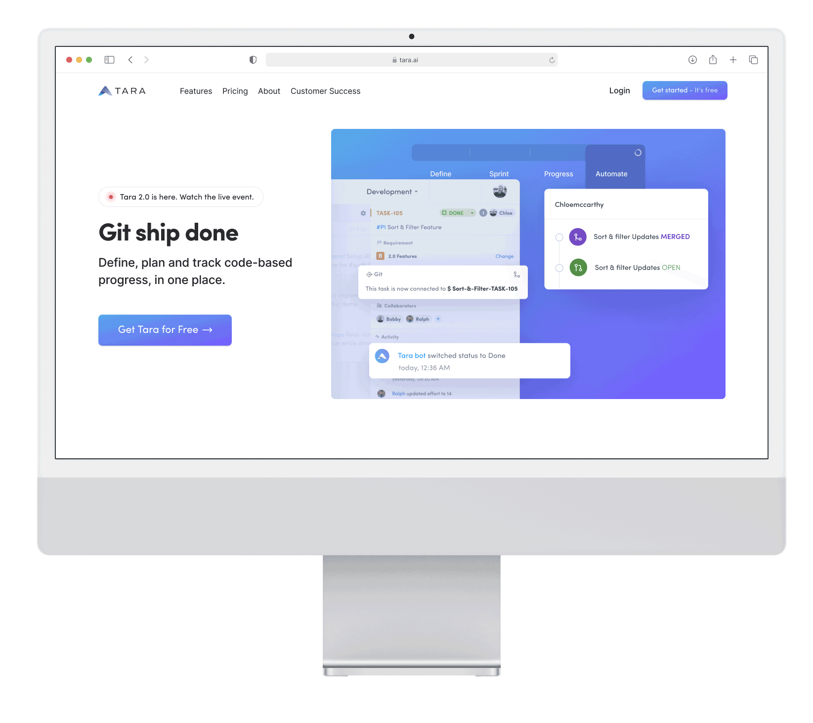
Tara.AI is a productivity platform for product and engineering teams to plan sprints, align specs, and track delivery. I led the design vision for a growth initiative to improve new-user acquisition by creating intent-aligned landing pages for campaign traffic, streamlining CTAs, and reducing onboarding friction in partnership with product, engineering, and growth. Using rapid research, competitive benchmarking, and iterative A/B testing, we launched a scalable landing-page framework that increased conversions by 30% and lowered CAC.
Goals
Improve conversion rates from paid/SEO campaigns
Reduce acquisition costs vs. industry benchmarks
Clearly communicate Tara’s value propositions tailored to visitor intent
Role
Product Designer
End-to-End UX & UI Design, User Research & Competitive Analysis, Journey Mapping & Wireframing, Visual & Interaction Design A/B Testing & Iteration
Responsibilities
Collaborators
VP of Product, CTA, Engineering, Growth/Marketing, Analytics
+30% increase in conversions from marketing traffic
Lower customer acquisition costs (CAC) compared to industry benchmarks
Established a scalable landing page framework for future growth campaigns
Impact
Timeline
6-8 Weeks
The Challenge
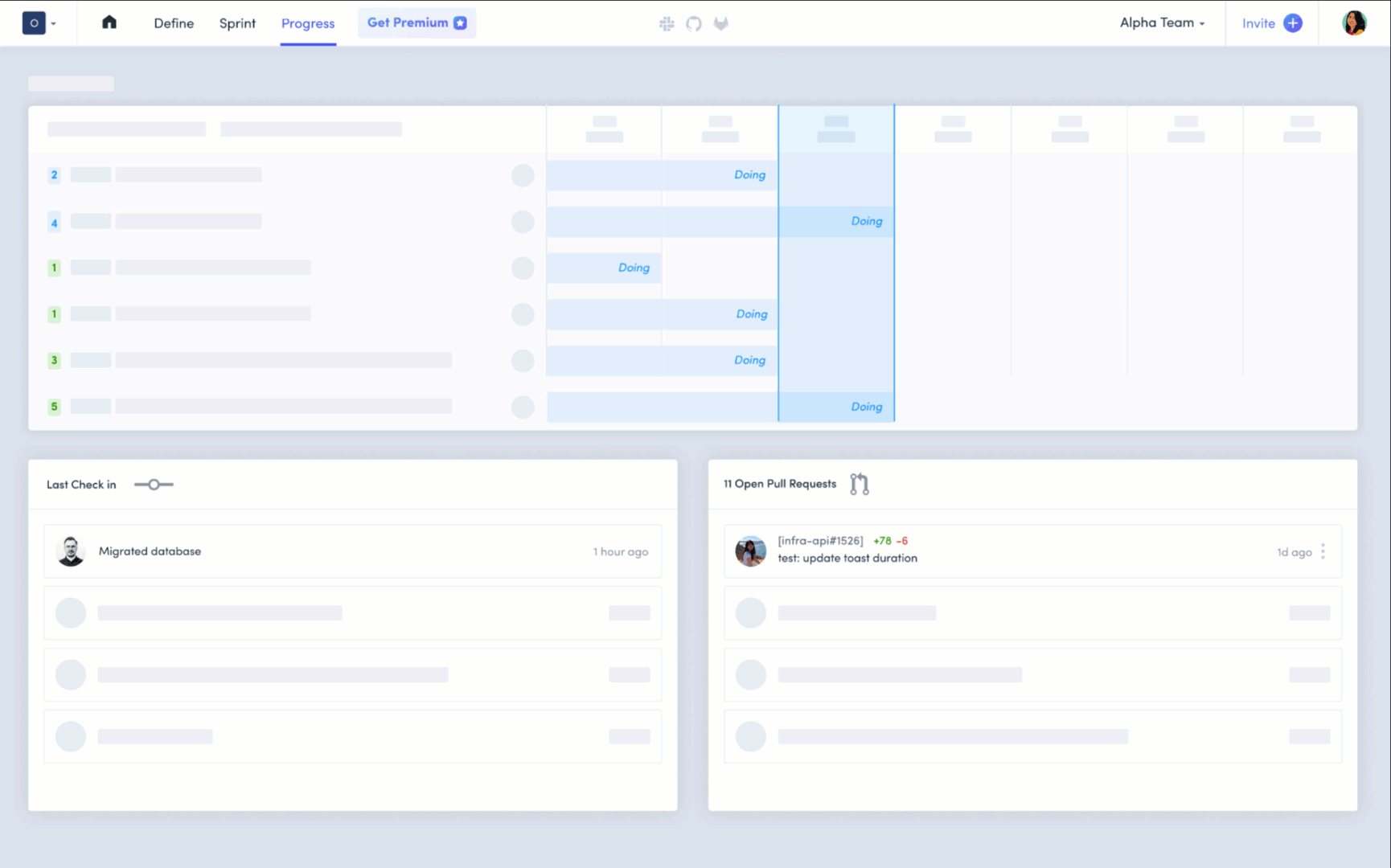
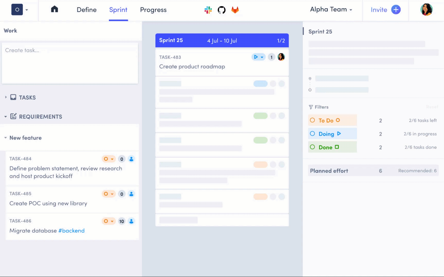
Tara’s marketing campaigns successfully brought traffic to its homepage, but the conversion rate to sign-ups was low. The homepage tried to serve multiple audiences and goals, creating distractions for users who had arrived with specific intents.
USER NEED
Help users quickly understand Tara’s value proposition and onboard with minimal friction.
BUSINESS NEED
Reduce the high cost of acquisition by improving the efficiency of marketing campaigns.
In Person Kick off
We began with a workshop to define key questions:
Why are users dropping off after landing?
What intent do users bring from different marketing channels?
How can Tara’s product value be surfaced faster?
Insights from talking to users

Home Page overload
Users were distracted by too much information not directly relevant to their search intent.

Friction in Onboarding
Too many steps before users could try the product. For example user’s need to signup for a free trial.

Distraction
Users were distracted by too much information not directly relevant to their search intent. Campaign keywords and homepage content didn’t always align, creating cognitive dissonance.
Competitive Analysis
Click Up
Intent-specific, compact landing pages that mirror ad/SEO keywords.
Clear, benefit-led headline and a single primary CTA above the fold.
Minimal distractions; supporting proof appears only after the CTA.
Takeaway: Match message to intent and keep the hero focused on one action.
Notion
Uses a long, multi-purpose homepage as a landing destination.
Dense content and motion/animation, but value proposition is very clear.
Great for exploration, less optimal for conversion-focused campaigns.
Takeaway: Rich storytelling builds clarity, but campaign traffic benefits from tighter, conversion-first pages.
Linear
Dark-mode aesthetic that resonates with developers/engineers.
Minimal copy, precise visuals, and a decisive single CTA.
Creates curiosity and feels “built for coders.”
Takeaway: Audience-aligned tone/style (e.g., dark mode) can lift engagement.

[How Might We]
How might we use tailored landing pages to better align with user intent, reduce distractions, and improve sign-up conversion rates?
Generating Iterations
Multiple Iterations
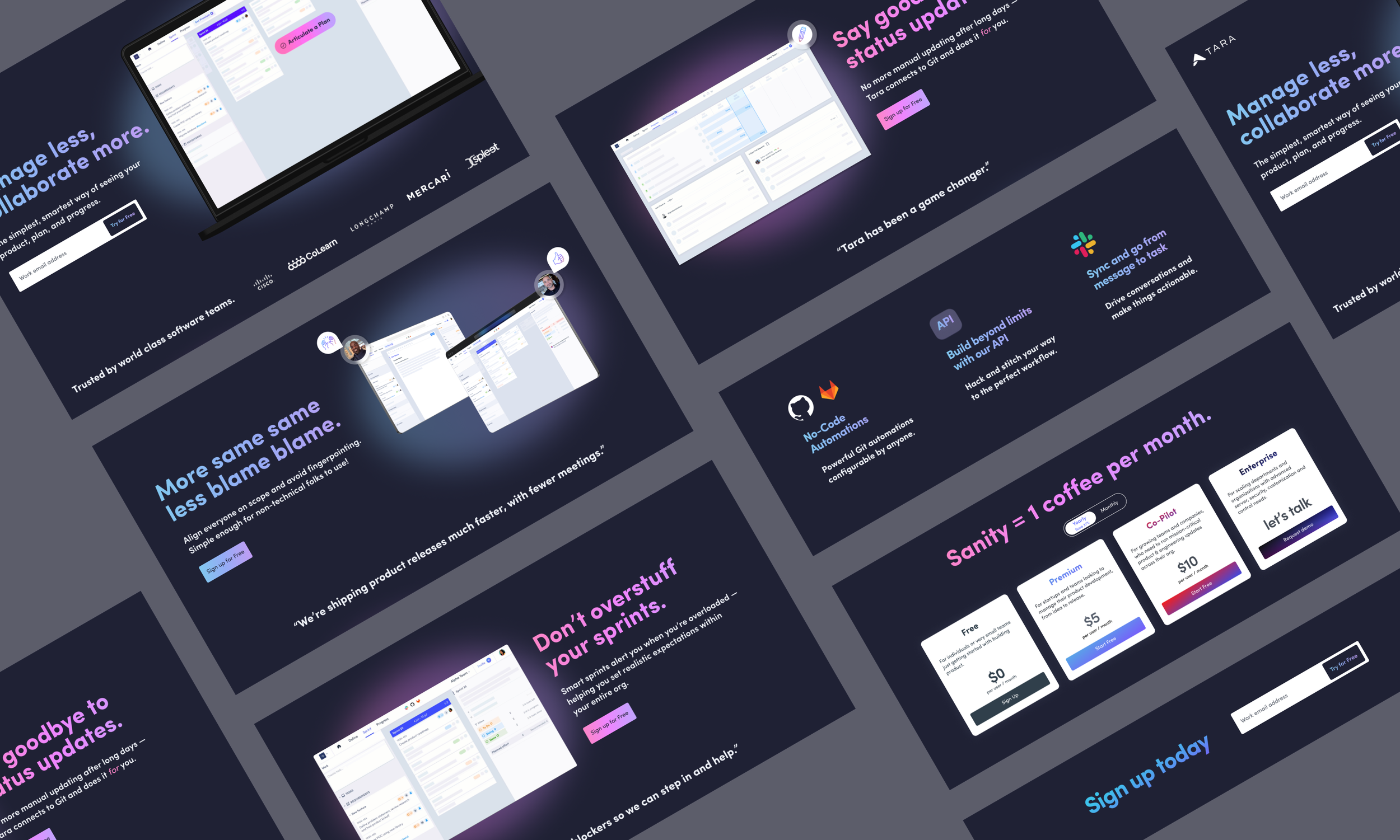
I rapidly explored landing page variations, starting with quick sketches and moving into high-fidelity mocks.
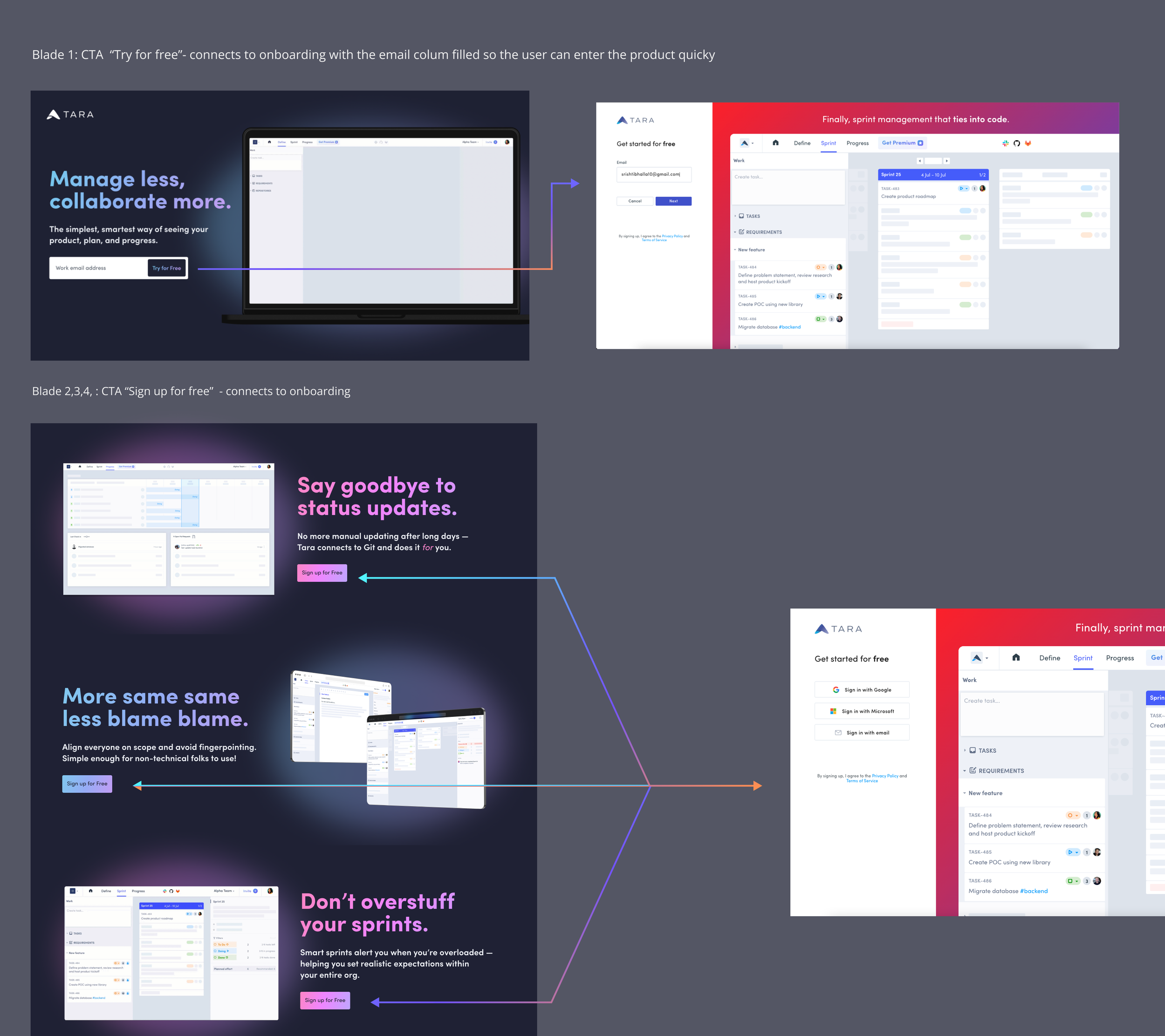
Key Experiments:
Dark Mode: Inspired curiosity and performed better in early tests with technical audiences.
CTA Simplification: One clear primary CTA (“Sign up with email”) with supporting CTAs directing into onboarding.
Keyword-driven Content: Pages tailored to reflect campaign messaging for alignment and trust.
Co-Design
Collaborated closely with marketing and product teams to refine copy, messaging hierarchy, and visual direction.
Iteration A — Light Mode + User Feedback
What we heard
Approachable and clean, but the primary action wasn’t obvious. Users scanned the hero and asked for a direct CTA to try the product immediately.
Action
Kept the light palette and tightened the hero copy. Tested placement of a single, explicit CTA (“Start free”) in the hero, with a secondary path (“See how it works”).
Takeaway
Clarity improved, but the light theme still felt less compelling to technical audiences compared to a darker, product-centric look.
✅ Approachable visual tone
✅ Clearer, single primary CTA
❌ Still felt “marketing-y” for dev/PM audiences
Iteration B — Dark Mode + User Feedback
What we heard
Dark theme felt more product-forward and credible for engineers/PMs. Strong preference for direct CTAs and concise copy.
Action
Switched to a dark hero with high contrast and prominent CTAs (primary “Start free” in hero; optional secondary “See demo”). Reduced copy to essentials.
Takeaway
The dark variant became the default for technical campaigns; the direct CTA pattern was adopted as a standard across landing pages.
✅ Prominent, direct CTAs above the fold
✅ Tone resonates with technical users
✅ Concise, scannable copy
⚠ Ensure WCAG contrast; keep light as an alternate when needed

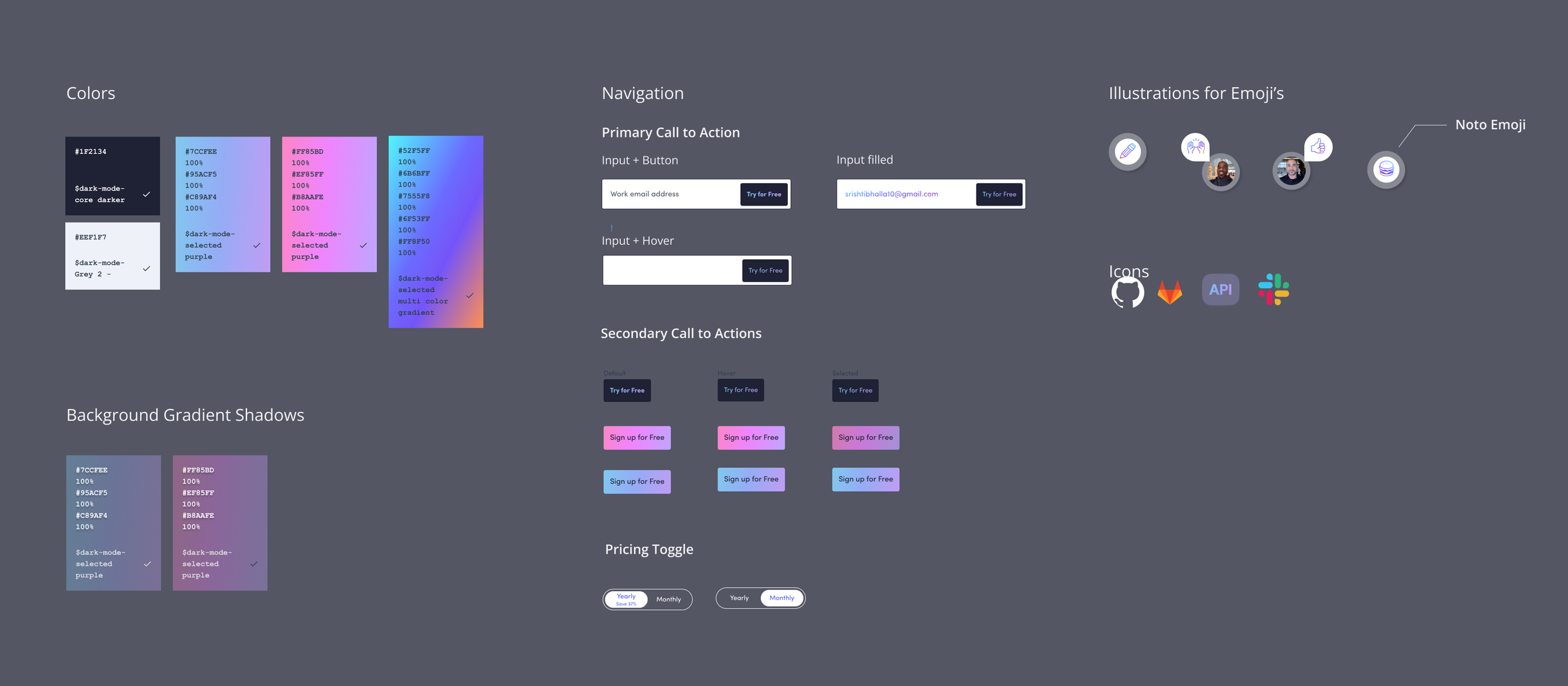
Ensuring Visual Consistency
I extended Tara’s design system to support new landing page modules.
Dark Mode Palette: Created new visual styles while maintaining Tara’s core identity.
CTA Components: Designed reusable CTA patterns for consistency across campaigns.
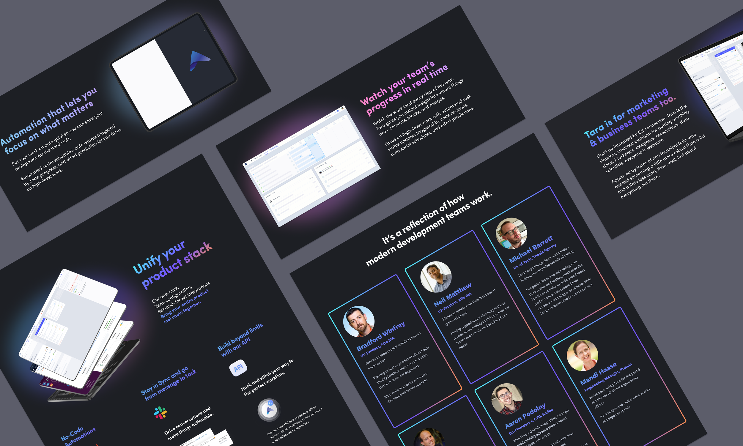
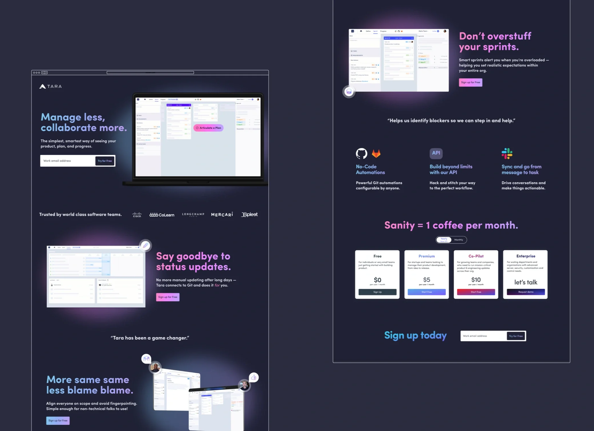
After multiple iterations and discussions. We finalized our landing Page
Final Design
Keyword-tailored Landing Pages: Aligned directly with campaign messaging.
Singular CTA: Reduced friction per fold, sending users straight to onboarding.
Dark Mode Option: Adopted for campaign pages targeting technical users.
Impact
+30%!
Conversion Improvement
Less
Customer Acquisition Cost
High
User Engagement from campaign traffic
Learnings and Takeaways
Landing pages with one goal perform better than multipurpose homepages.
Keyword alignment between campaigns and landing experiences builds trust.
Personalization based on marketing channels increases relevance.
Small UX changes — like CTA design, form length, or messaging — can yield major conversion lifts.
Design is most powerful when data-driven and iterative, grounded in testing.
TARA.AI
Automating Blocker Detection to Accelerate Engineering Teams
25% Customers adopted “Blocker’s Report” in MVP Testing
2-3 hrs/week saved manual tracking time for managers
Onboarding + Design System + Web App