PRACTICEPANTHER CASE STUDY
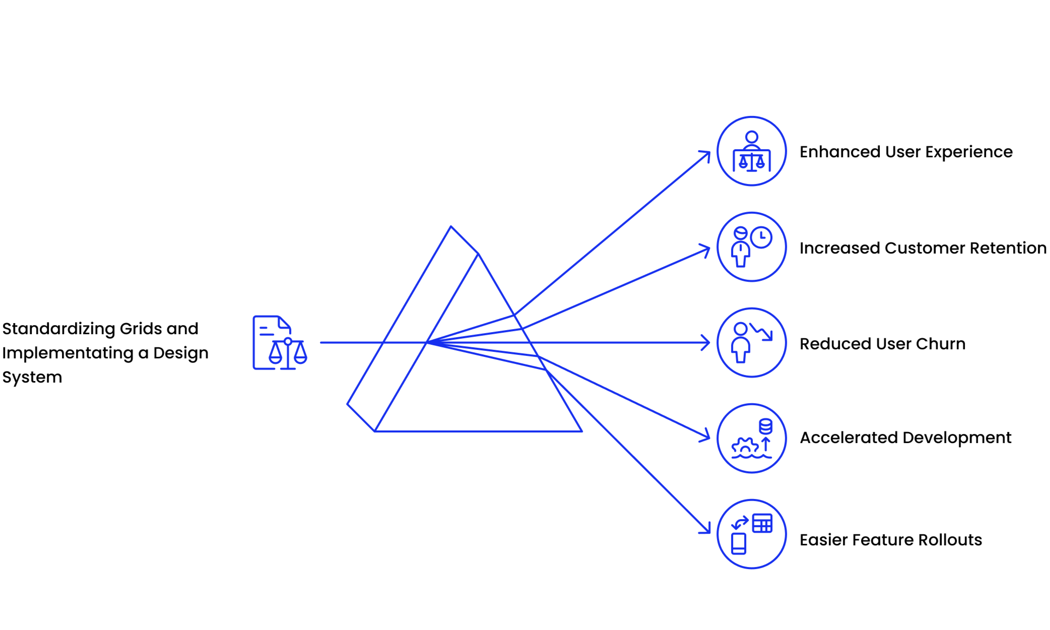
Streamlining Legal Workflows with PracticePanther’s Payments Grid
Overview
I led the redesign of PracticePanther’s Payments Dashboard to integrate trust accounting following its TrustBooks acquisition. Driving research, data analysis, prototyping, and testing, I replaced legacy Kendo grids with React and co-created a scalable design system for consistency across the platform.
Partnering with product, engineering, and legal experts, we launched a modern, lawyer-friendly interface featuring advanced filters, bulk actions, and a new Insights Dashboard.
Goals
Integrate trust accounting into core workflows post-acquisition
Improve usability and efficiency for legal professionals
Set a new visual and functional standard across the platform
Role
Lead Product Designer
Responsibilities
UX Audit, User research, Usability test prototyping, UI design, Built a new a design system, Standardization of the grid system
Collaborators
Collaborated with a lean cross-functional team, including the VP of Product, Associate Product Designer, two PMs, and 10+ Engineers. As one of only two designers, I led end-to-end design execution in a fast-paced, high-impact environment.
Impact
8.6/10 NPS was received by users in post launch surveys citing ease of use as the top reason
7,200 of the 8,000 users who toggled on the new dashboard 90% kept it on after 30 days, indicating strong retention and satisfaction with the redesign
50 secs page refresh time when bulk actions are applied from the previous 7 mins
Timeline
6 months
The Challenge
PracticePanther’s legacy payments grid was outdated, slow, and hard to use — leading to decision fatigue, frequent support tickets, and missed opportunities for workflow efficiency.
To evolve into a unified legal platform post-acquisition, we needed to modernize the dashboard to support trust accounting, improve usability, and lay the groundwork for scalable, cross-product consistency.
USER NEED
Make payment workflows faster and easier by fixing discoverability, reducing clutter, and surfacing critical financial data clearly.
BUSINESS NEED
Redesign the Payments Dashboard to integrate trust accounting and support platform-wide modernization.
Where We Started
Current Grid 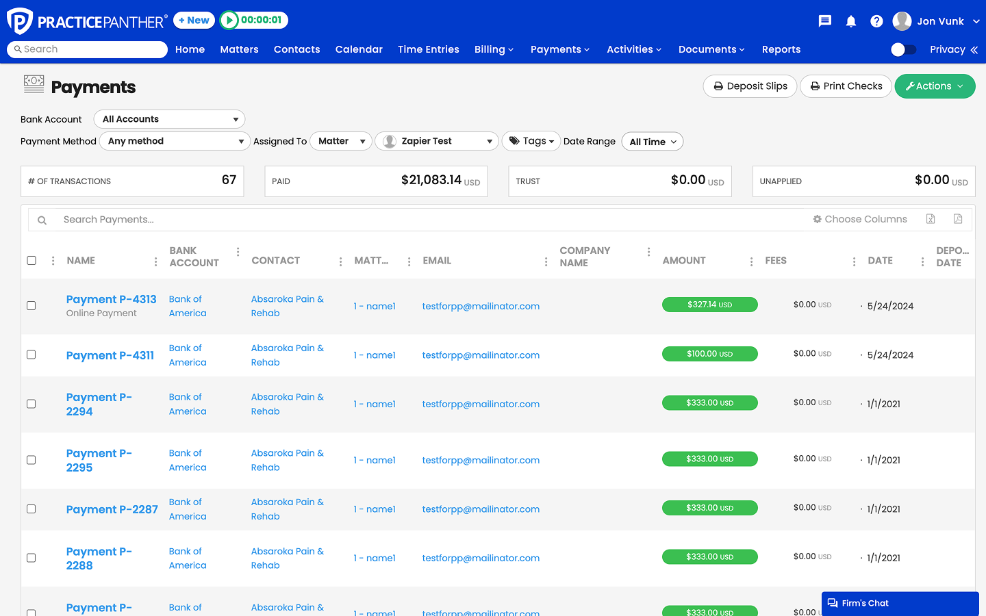
Filters in the current grid. 
Business Shift: Evolving from a standalone legal management tool to a unified platform, integrating several recent acquisitions.
Design & Tech Challenges: The legacy design and infrastructure were outdated—limiting innovation, scalability, and integration.
Critical Pain Point: The old grid system lacked flexibility and couldn’t support modern features or workflows.
At this pivotal moment, I led the redesign of the payment grids; setting a new standard for usability, scalability, and cross-product integration. This redesign became the blueprint for modernizing other core features across the platform.
Understanding the landscape—and what wasn’t working

As the designer, I analyzed the existing payment’s dashboard and the current user experience. I conducted a UX audit for the all the grids in Practice Panther to spot any
usability issues.
What the data revealed about the payments table?
7 mins
page refresh time when bulk actions are applied
40%
support tickets related to users unable to analyze total payments
8%
churn rate, resulting in over $80,000 lost revenue in a year
4.6/10
usability survey score
Before we designed, We listened
I spoke with attorneys, paralegals, and billing coordinators; the people in the trenches every day.
To truly understand the pain points behind the legacy payments grid. Through 12 in-depth user interviews, I uncovered how the system was slowing them down, creating confusion, and failing to support real-world billing workflows. Their stories became the foundation for everything that followed.

What people are saying?
“I don’t have time to dig through filters that don’t work. I miss payments and it throws off my whole day”
— Jody Kaufman, Solo Attorney
“My company uses PracticePanther, but I feel so lost in here. I can’t find things most of the time. I have to learn to use as I work here”
— Hannah Miller, Paralegal at Kessler Group
“I need trust totals front and center. Hunting for them makes me worry we’ll mess up compliance, this is why I have to maintain a separate excel sheet”
— Jenna Ali, Billing Coordiator at RMW Law Group
“I handle payments for 20 clients a day and the page just freezes on me”
— Elizabether Reuter, Billing Manager at Neiman Group
Key Insights and Themes
Users struggle to quickly find and understand payment information, leading to inefficiencies, confusion about statuses, and missed opportunities to act on critical financial tasks

Slow and inefficient workflows
Bulk actions were taking up to 7 minutes to process, frustrating attorneys and billing coordinators and creating unnecessary delays.

Poor discoverability of critical data
Attorneys and paralegals found it hard to locate trust totals and key financial metrics, often resorting to external spreadsheets to ensure compliance.

Cluttered and inconsistent grid experience
Hidden filters, confusing layouts, and outdated infrastructure led to decision fatigue and frequent support tickets, reducing confidence in the system.
Seeing the bigger picture for PracticePanther and the scope of
the problem.
The research made one thing clear: this wasn’t just about fixing a single payment’s grid; it was an opportunity to standardize grids across the platform. With new features from TrustBooks adding complexity, we also needed a scalable design system. The potential user impact was significant.
Generating Iterations
To meet tight deadlines, we prioritized rapid iteration, starting with high-fidelity mocks. Collaborating with Product, we refined key areas for the payment’s page.

Data Clarity
Key totals without endless scrolling

Advanced Filters
Powerful search tools easy to use

Efficiency Tools
Bulk actions, pagination, saved views
I began with quick wireframes, simple layouts featuring prominent filters and totals. In Figma, those ideas turned into low-fidelity wireframes to test the flow. After gathering feedback, I refined the designs into high-fidelity, React-ready components: a streamlined Payments Grid, Insights Dashboard, bulk actions, and Saved Reports. With each iteration, the vision got clearer; shaped by what users actually needed.
Iteration 1 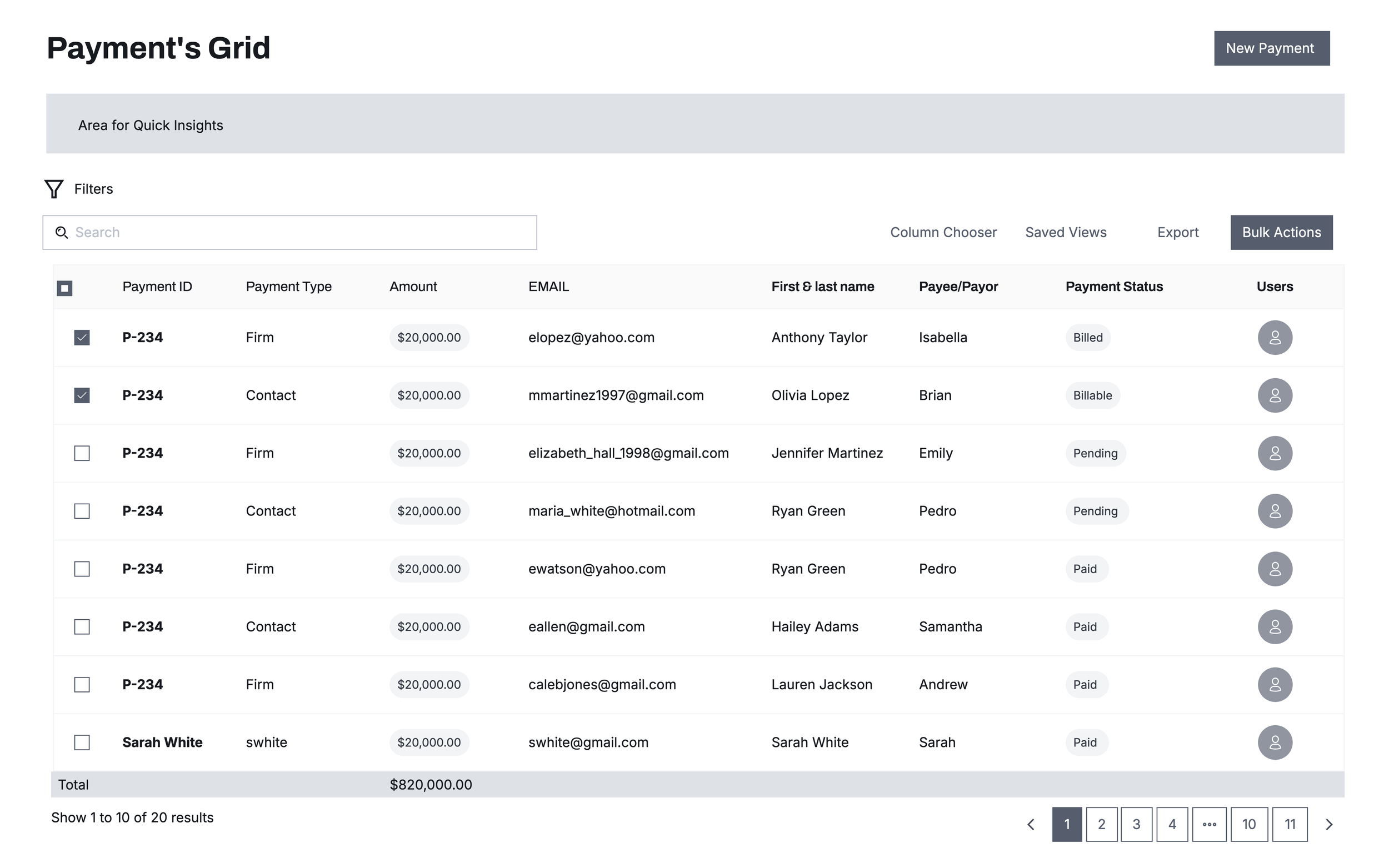
Iteration 1: Minimal Grid
Insight
Users appreciated the modern, minimal design but disliked having filters hidden, since it meant extra clicks to refine results. Lawyers in particular needed quick access to filters for efficiency.
Action
Started with a grid-focused design and hidden filters to maximize visual space.
Labeled batch functions as Bulk Actions.
Takeaway
Minimalism worked visually but reduced efficiency for our core user group.
✅ Clean design
❌ Hidden filters slowed lawyers down
Iteration 2
Iteration 2: Filter Manager & Custom Views
Insight
Users wanted filters always visible, and also requested ways to save their preferred grid setups for repeated use.
Action
Introduced a Filter Manager with chips for quick toggling.
Added Clear and Reset functions for easy management.
Split New Payment into Contact Payment and Firm Payment.
Introduced Saved Views/Reports, allowing users to save and return to personalized configurations.
Renamed Bulk Actions → Actions for clarity.
Takeaway
Filters became highly accessible, and Saved Views/Reports empowered recurring workflows. However, the growing number of controls risked visual clutter.
✅ Always-visible filters + custom reports
❌ Risked visual clutter
Iteration 3
Iteration 3: Insights dashboard
Insight
Users expressed a need for daily financial snapshots beyond raw transactions, so they could make quick business decisions.
Action
Added a Totals bar with key metrics: Total Transactions, Paid, Contact Payment, Firm Payment, Trust, and Available Funds.
Retained Filter Manager and Saved Reports for efficiency.
Continued split of payment actions for mental clarity.
Added Pagination to manage large sets of results without overwhelming the screen.
Implemented a Sticky Header so filters and actions remain visible as users scroll through long lists.
Takeaway
The Payment’s Grid transitioned from a data table into a daily insights hub. Pagination and a sticky header made navigation smoother and ensured critical controls stayed accessible during long sessions.
✅ Daily financial snapshots + pagination + sticky header
🚀 Became a true “insights hub”
Validating with Usability Testing

Maze Testing Objective
To test if the redesigned Payment’s Grid improved efficiency, accuracy, and clarity in real workflows.
Approach
Conducted unmoderated usability tests in Maze
Participants: 467 users
Tasks included:
Using the Date Picker
Applying multiple filters
Identifying Payment Status
Navigating through paginated results
Key Insights
Filter Placement: Above the grid improved discoverability
Date Picker: Well received, though direct date input was requested
Miscalculation Spike: 50% at Month/Year dropdown → informed simplification
Usability Scores: Averaged 80+, with best screens scoring 95
Ensuring Visual Consistency with Design System
While refining the Payment’s dashboard, I established a design system strategy. The goal was to replace outdated Kendo Grid with a React based system that ensures consistency, accessibility and long term scalability.
Core Component
Standardized building blocks for filters, date pickers, and bulk actions, ensuring every new feature looks and works consistently.
Accessibility
High contrast states & keyboard navigation
Scalability
Modular components for future grid enhancements
Consistency
Aligned with Brand UI while modernizing interactions
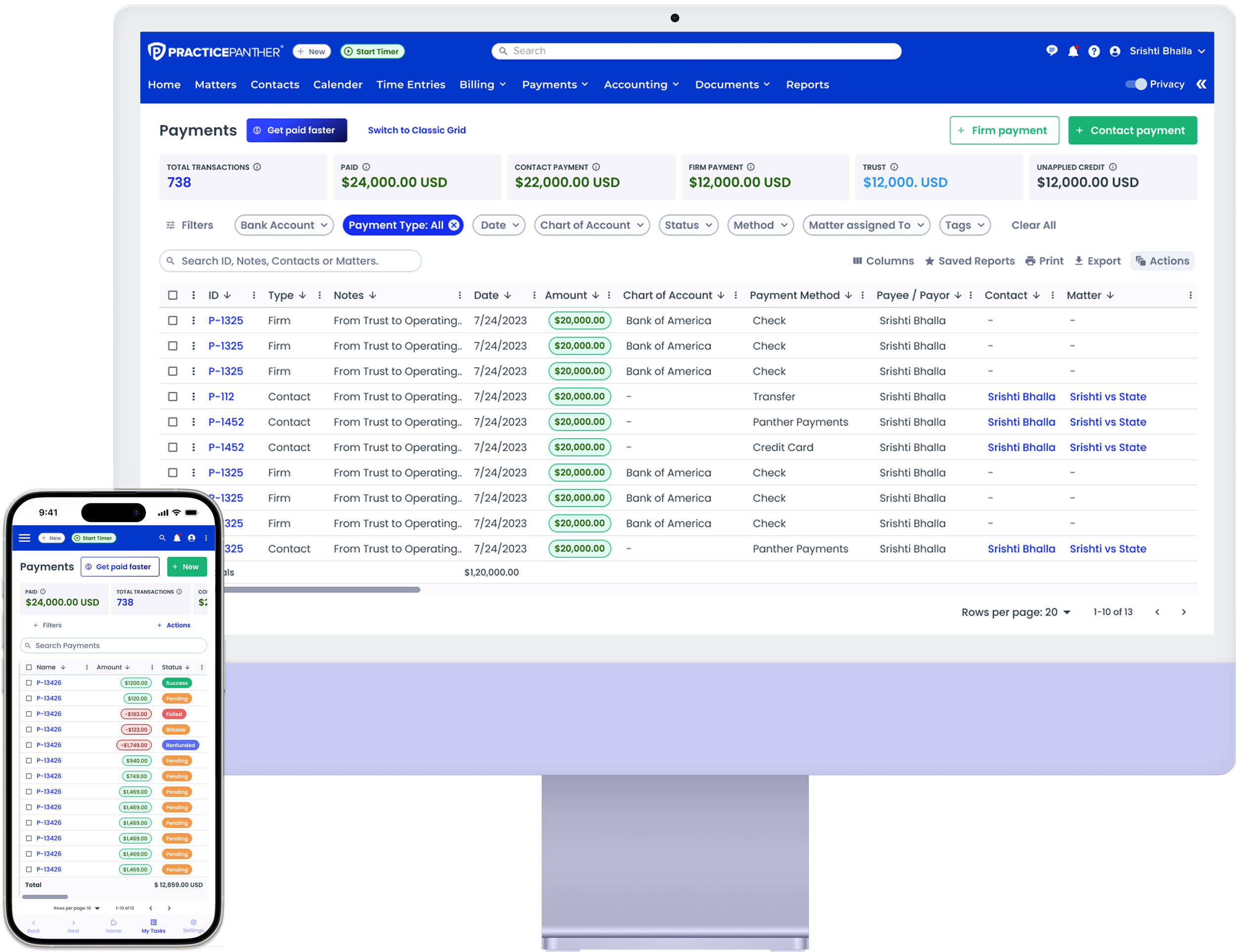
Introducing the Final Payment’s Dashboard
This is the new Payments Grid—crafted to empower attorneys with effortless clarity and control. We launched it behind a feature flag, allowing users to gradually transition while still accessing the legacy dashboard. The new design introduces fast filters, instant totals, and seamless actions, creating a workflow that feels intuitive and powerful. It’s a thoughtful step toward the future of PracticePanther.
Built for seamless billing workflows
Smart Filters for Seamless Workflows
Quick, organized, and effortless filtering — built for the fast-paced demands of legal billing.
Smart Filters bring speed and clarity to every search. Designed for law firms, this feature lets attorneys and billing coordinators add quick filters; single or multiple; with ease, while the “Manage Filters” option keeps everything organized. Users can now filter payments in seconds, with all options visible at a glance or reset to default effortlessly.
Bulk Actions for Faster Workflows
Bulk actions that cut down on manual work and bookkeeping stress.
Bulk Actions make it easy for attorneys and billing coordinators to manage multiple payments at once. They can now approve, delete, or sync payments directly to QuickBooks in just a few clicks, cutting down on repetitive tasks and reducing bookkeeping stress.
Faster Search for Easy Access
Faster Search makes it simple for attorneys and billing coordinators to track down payments. They can now search by Payment ID, Notes, Contacts, or Matters in a snap, and the Dashboard Insights update instantly to show the latest totals.
Finding What You Need, Fast
New Date Filter for Better Control
The redesigned Date Filter gives attorneys and billing coordinators the flexibility to choose dates their way. From quick presets like “Last Quarter” to custom ranges, users can now zero in on the exact timeframe they need. Simple, intuitive, and reliable — it makes reviewing payments faster and more precise.
Pick Dates Your Way
Custom Reports for Better Insights
Save Reports let attorneys and billing coordinators create views that fit their needs. They can pick the columns they want, save the setup, and come back to it anytime; no need to start over with filters. This makes it easy to track clients and payments in a way that works for them making reports very simple to save and to reuse.
Save Reports That Work for You
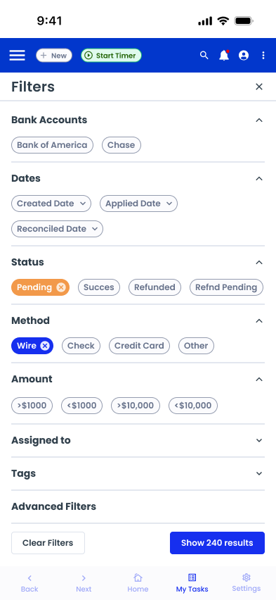
Mobile-Optimized Payments Grid Experience
We reimagined the Payments Grid with a mobile-first approach. A fixed first column for easier data scanning during horizontal scrolling. A horizontally scrollable insights bar for quick KPI access without cluttering the view. A newly designed filter panel, optimized for mobile interaction with expandable sections and tappable chips.These improvements empower users to manage complex payment data efficiently even on smaller screens.
Redesigned for Mobile Usability & Efficiency
Amount Filter
The new Amount Filter lets attorneys and billing coordinators narrow down payments by specific amounts. They can use simple operators; like greater than or less than; to find payments over $500 or under $100 in a snap. It’s perfect for zeroing in on the exact payments they need.
Insights Dashboard
The Insights Dashboard gives attorneys and billing coordinators a quick snapshot of all their payments. They can instantly see totals for transactions, paid amounts, trust accounts, and more; no digging required. This helps them keep a clear picture of their finances every day.
Launch & Impact
Mix Panel Events: Prior to launch we added multiple events to track the usability of our new rolled out payment’s dashboard.
50 secs
Page refresh time when bulk actions are applied
1000
Saved Reports created in first week
15,000
Searches in the first week using the faster Search Feature
90%
Retention after 30 days, covering almost 29% of our user base
70%
Users applied the new date filter within first 2 weeks with “last quarter” being the most popular choice
8.6/10
NPS was received by users in post launch surveys citing ease of use as the top reason
Key Learnings
The Payments Dashboard redesign not only streamlined workflows for thousands of attorneys but also set the blueprint for modernizing PracticePanther’s entire platform. By pairing user insights with scalable design systems, we delivered an experience that’s faster, clearer, and lawyer‑friendly — and one I’m proud to say continues to drive efficiency across the product today.

Design systems amplify impact
Establishing reusable React components transformed a one‑off redesign into a scalable foundation for future features, reducing design and dev time.

Testing drives smarter decisions
Maze usability testing revealed hidden pain points and guided design pivots that improved usability scores

Minimalism doesn’t always mean better
While a minimal grid looked clean, users found it less efficient. I learned to balance aesthetics with functionality sometimes more visible controls equal a better experience.
TARA.AI
Turning Clicks to Customers
30% Increase in conversions from market traffic
Lower Customer Acquisition Costs
Landing Page + A/B Test + SEO