I led the design vision for a growth initiative to improve new-user acquisition by creating intent-aligned landing pages for campaign traffic, streamlining CTAs, and reducing onboarding friction in partnership with product, engineering, and growth.
Tara.AI is a productivity platform for product and engineering teams to plan sprints, align specs, and track delivery. Using rapid research, competitive benchmarking, and iterative A/B testing, we launched a scalable landing-page framework that increased conversions by 30% and lowered CAC.
Increase in conversions from marketing traffic
Lower customer acquisition costs (CAC) compared to industry benchmarks
Established a scalable landing page framework for future growth campaigns
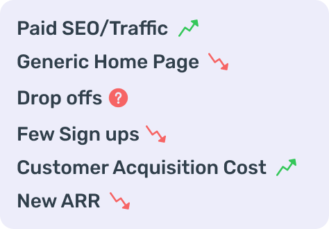
Tara's marketing campaigns successfully brought traffic to its homepage, but the conversion rate to sign-ups was low. The homepage tried to serve multiple audiences and goals, creating distractions for users who had arrived with specific intents.
Help users quickly understand Tara's value proposition and onboard with minimal friction.
Reduce the high cost of acquisition by improving the efficiency of marketing campaigns.
We began with a workshop to define key questions:
Why are users dropping off after landing?
What intent do users bring from different marketing channels?
How can Tara's product value be surfaced faster?
Takeaway: Match message to intent and keep the hero focused on one action.
Takeaway: Rich storytelling builds clarity, but campaign traffic benefits from tighter, conversion-first pages.
Takeaway: Audience-aligned tone/style (e.g., dark mode) can lift engagement.
How might we use tailored landing pages to better align with user intent, reduce distractions, and improve sign-up conversion rates?
I rapidly explored landing page variations, starting with quick sketches and moving into high-fidelity mocks. Key experiments included dark mode, CTA simplification, keyword-driven content, and co-design with marketing and product teams.
Approachable and clean, but the primary action wasn't obvious. Users scanned the hero and asked for a direct CTA to try the product immediately.
Kept the light palette and tightened the hero copy. Tested placement of a single, explicit CTA ("Start free") in the hero, with a secondary path ("See how it works").
Clarity improved, but the light theme still felt less compelling to technical audiences compared to a darker, product-centric look.
Dark theme felt more product-forward and credible for engineers/PMs. Strong preference for direct CTAs and concise copy.
Switched to a dark hero with high contrast and prominent CTAs (primary "Start free" in hero; optional secondary "See demo"). Reduced copy to essentials.
The dark variant became the default for technical campaigns; the direct CTA pattern was adopted as a standard across landing pages.
I extended Tara's design system to support new landing page modules:
Dark Mode Palette: Created new visual styles while maintaining Tara's core identity.
CTA Components: Designed reusable CTA patterns for consistency across campaigns.
Aligned directly with campaign messaging.
Reduced friction per fold, sending users straight to onboarding.
Adopted for campaign pages targeting technical users.
Landing pages with one goal perform better than multipurpose homepages.
Keyword alignment between campaigns and landing experiences builds trust.
Personalization based on marketing channels increases relevance.
Small UX changes — like CTA design, form length, or messaging — can yield major conversion lifts.
Design is most powerful when data-driven and iterative, grounded in testing.