Back to Portfolio
Case Study 3
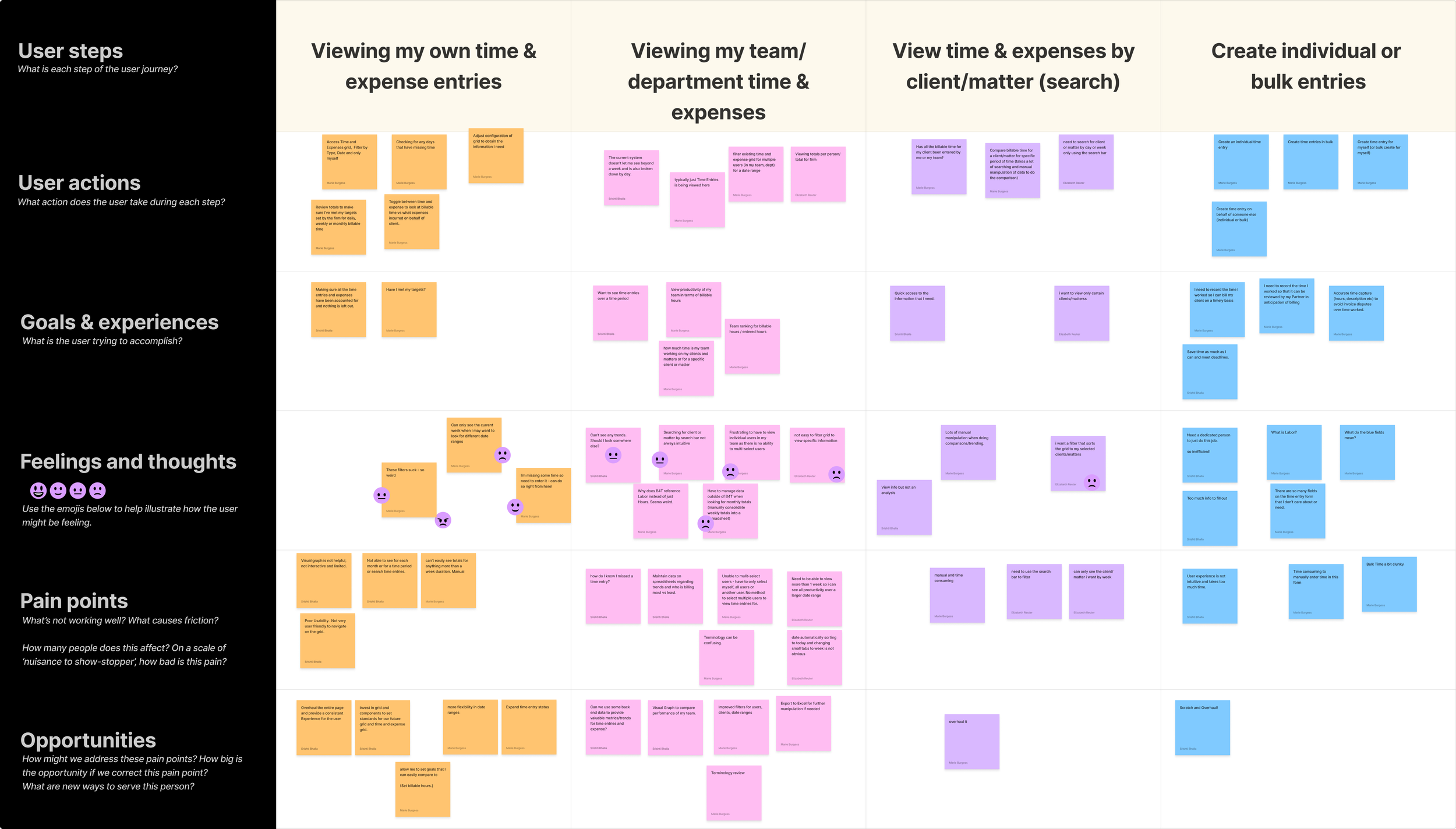
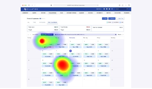
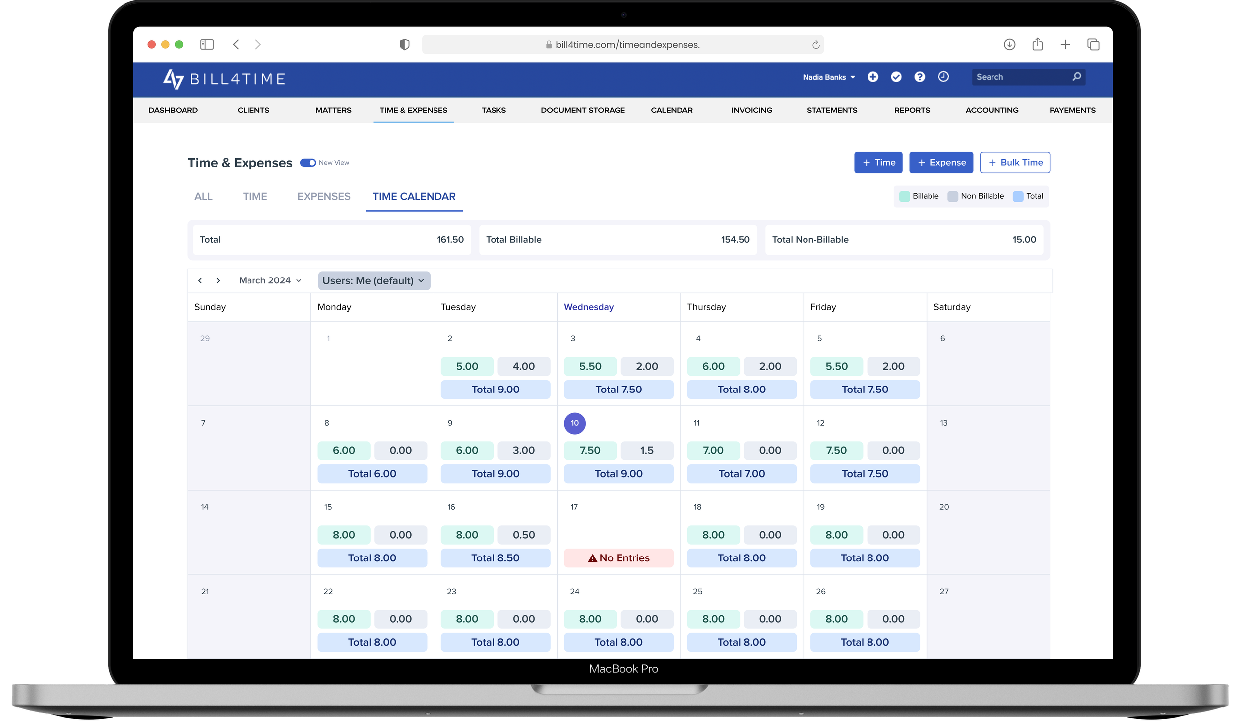
Making Every Billable Hour Count
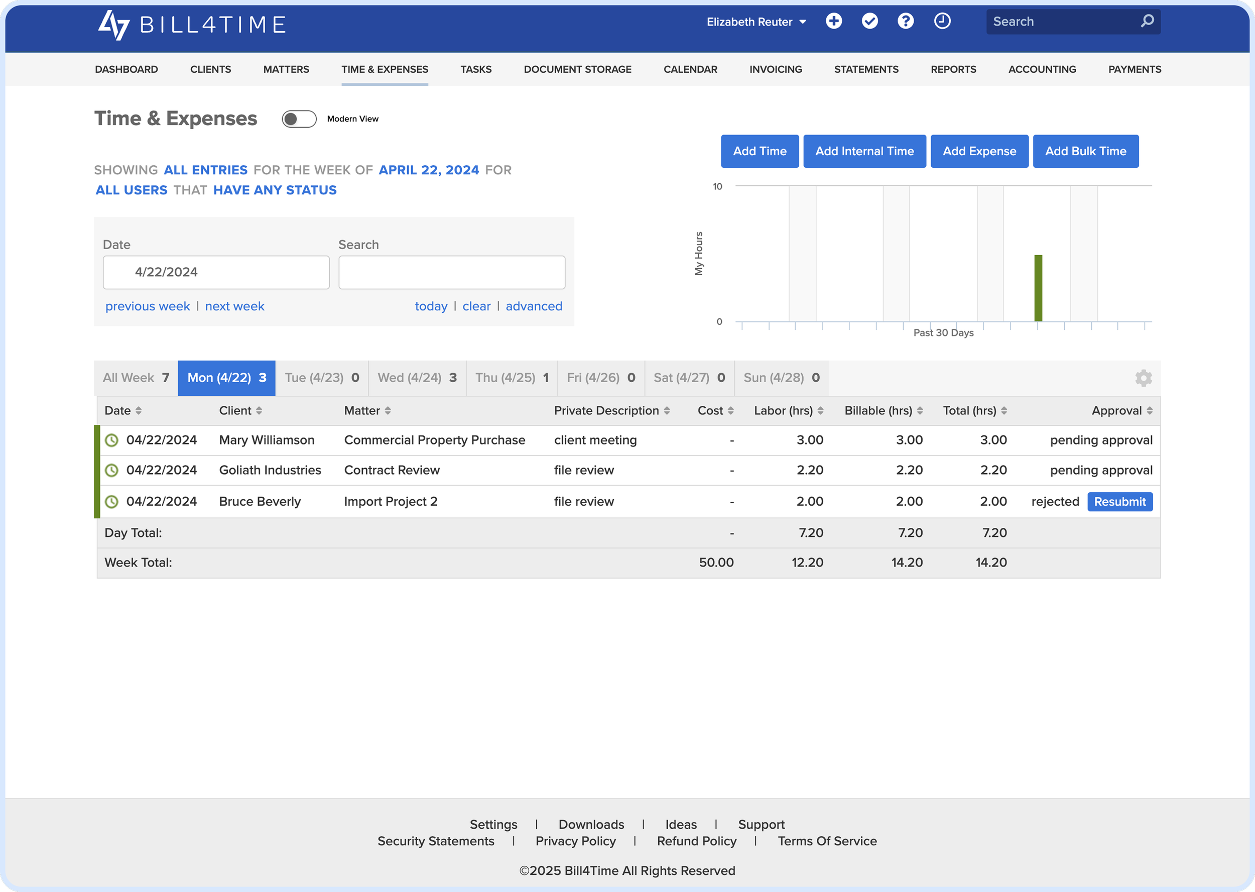
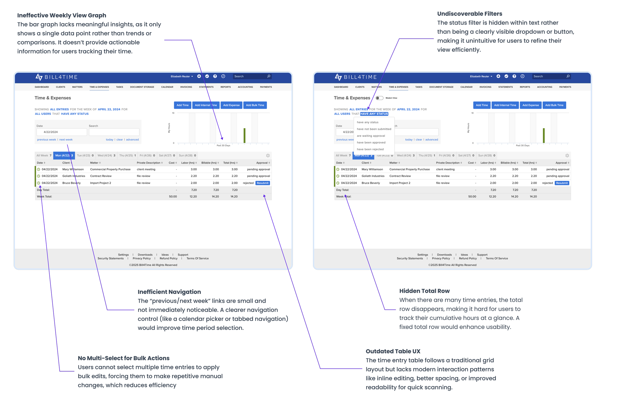
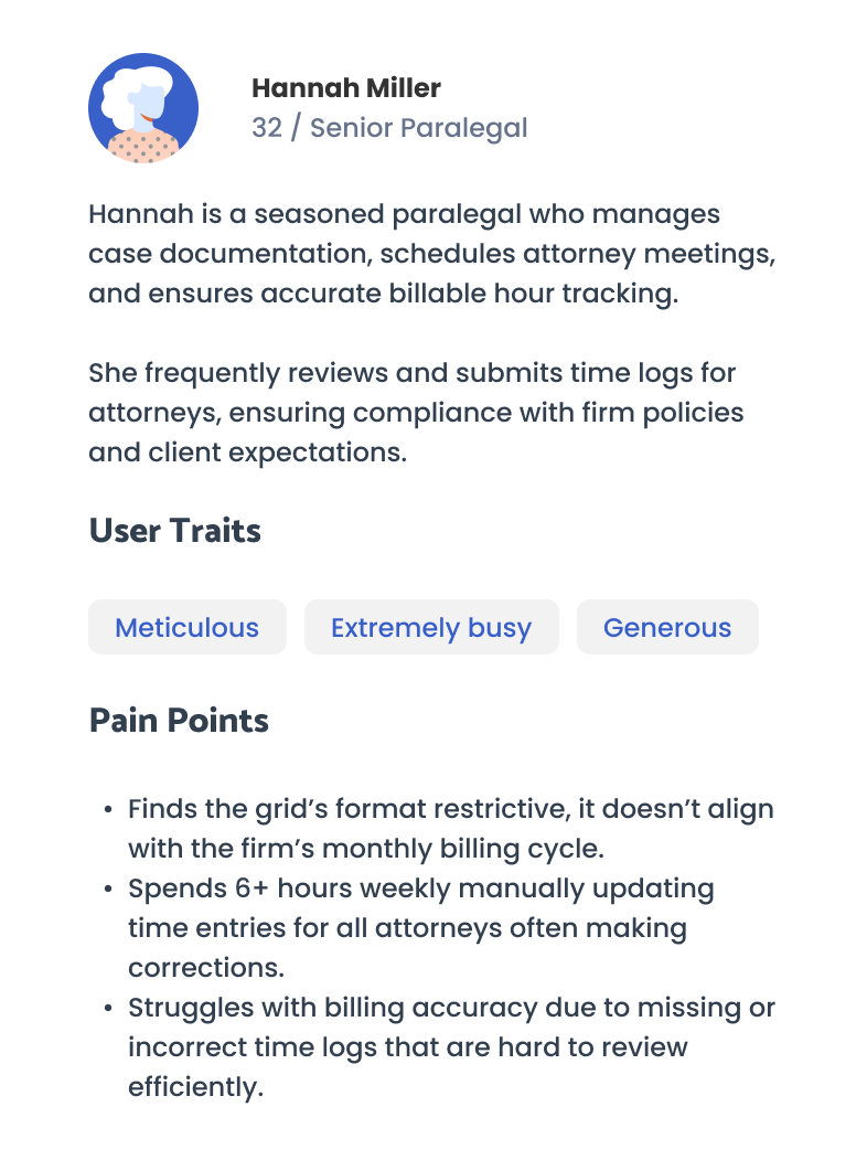
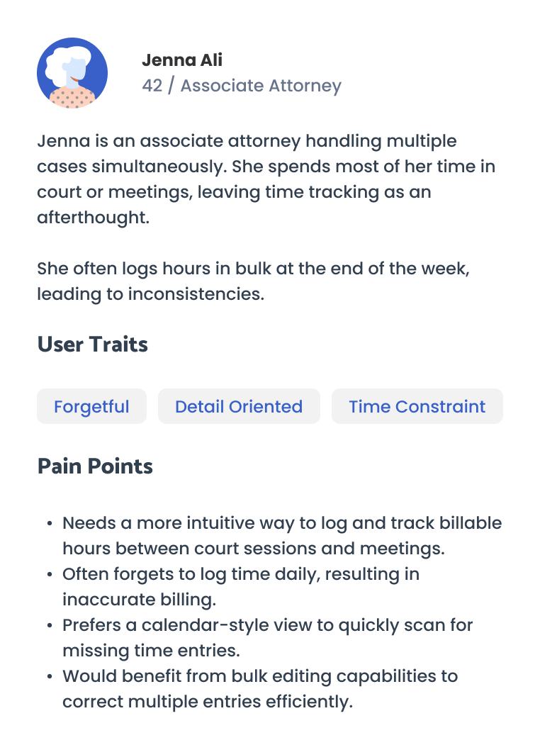
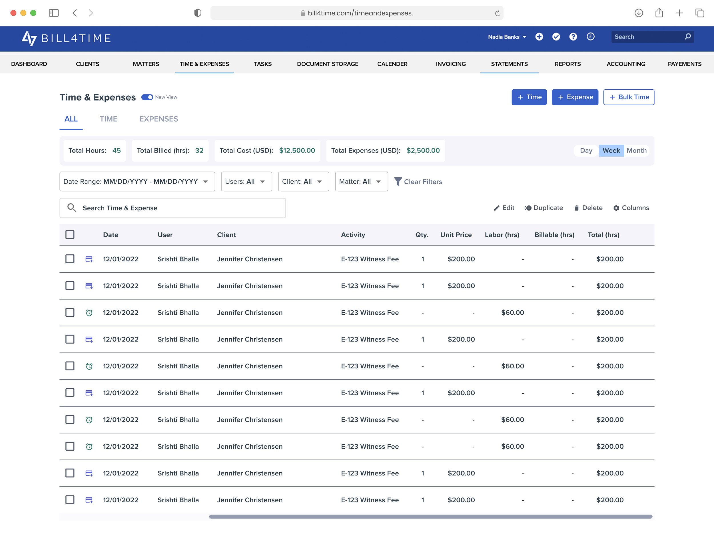
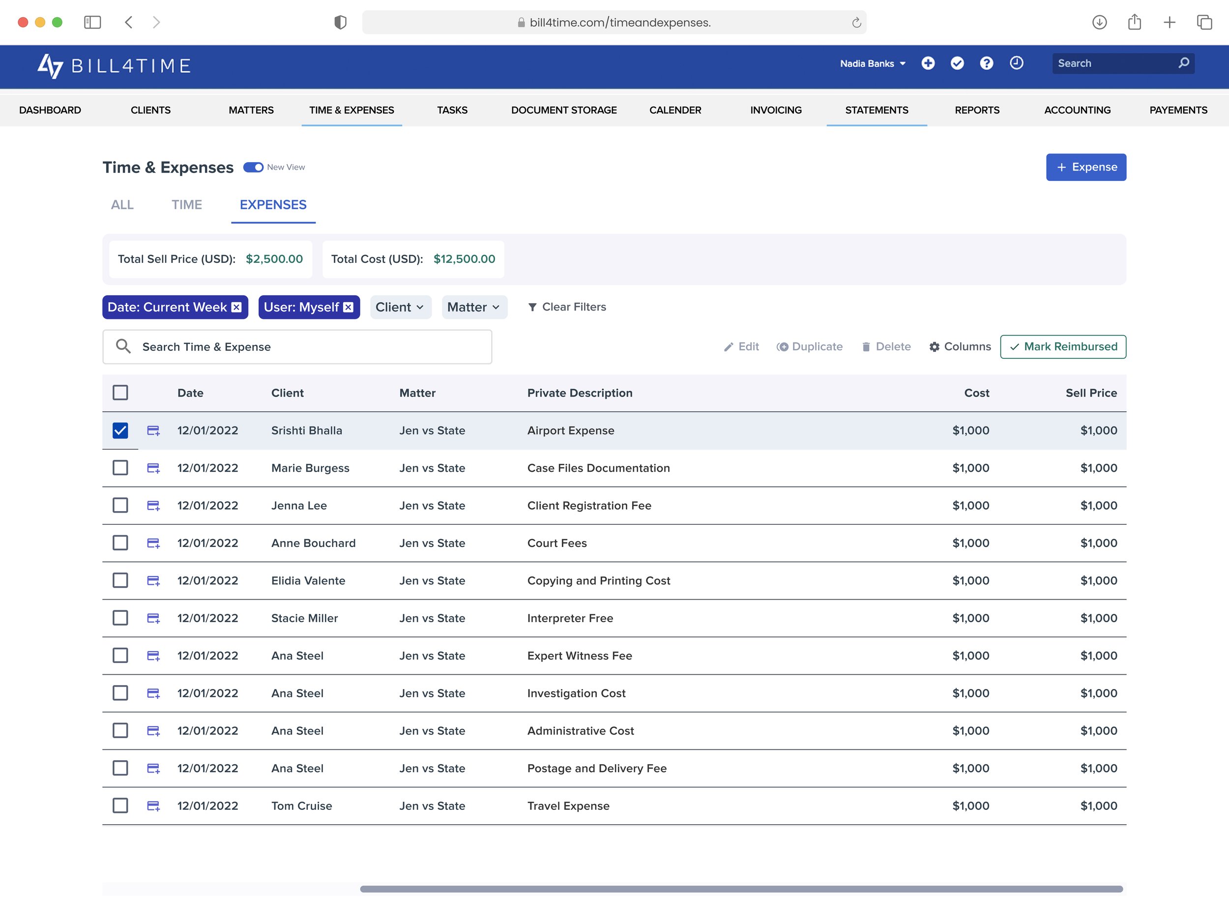
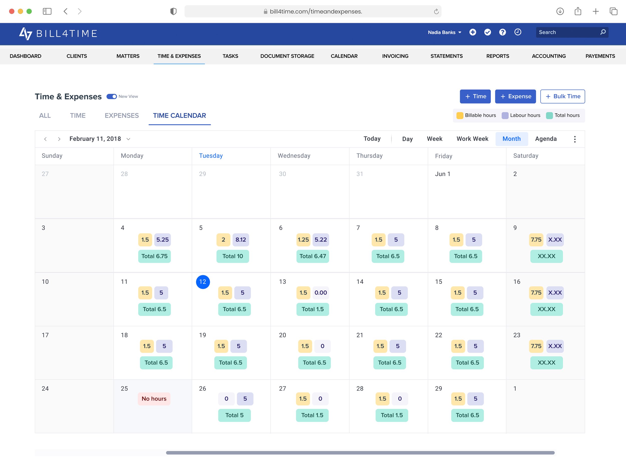
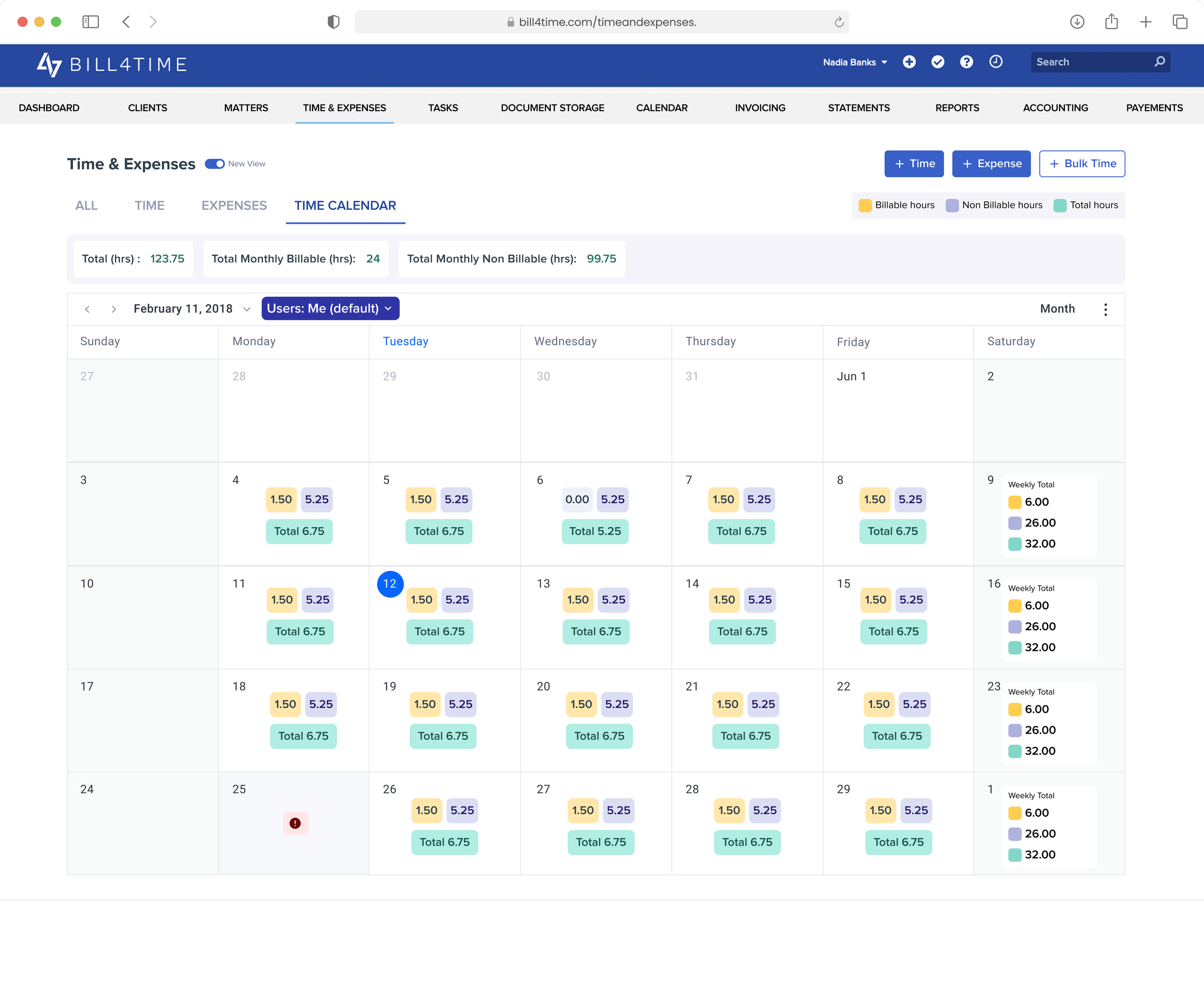
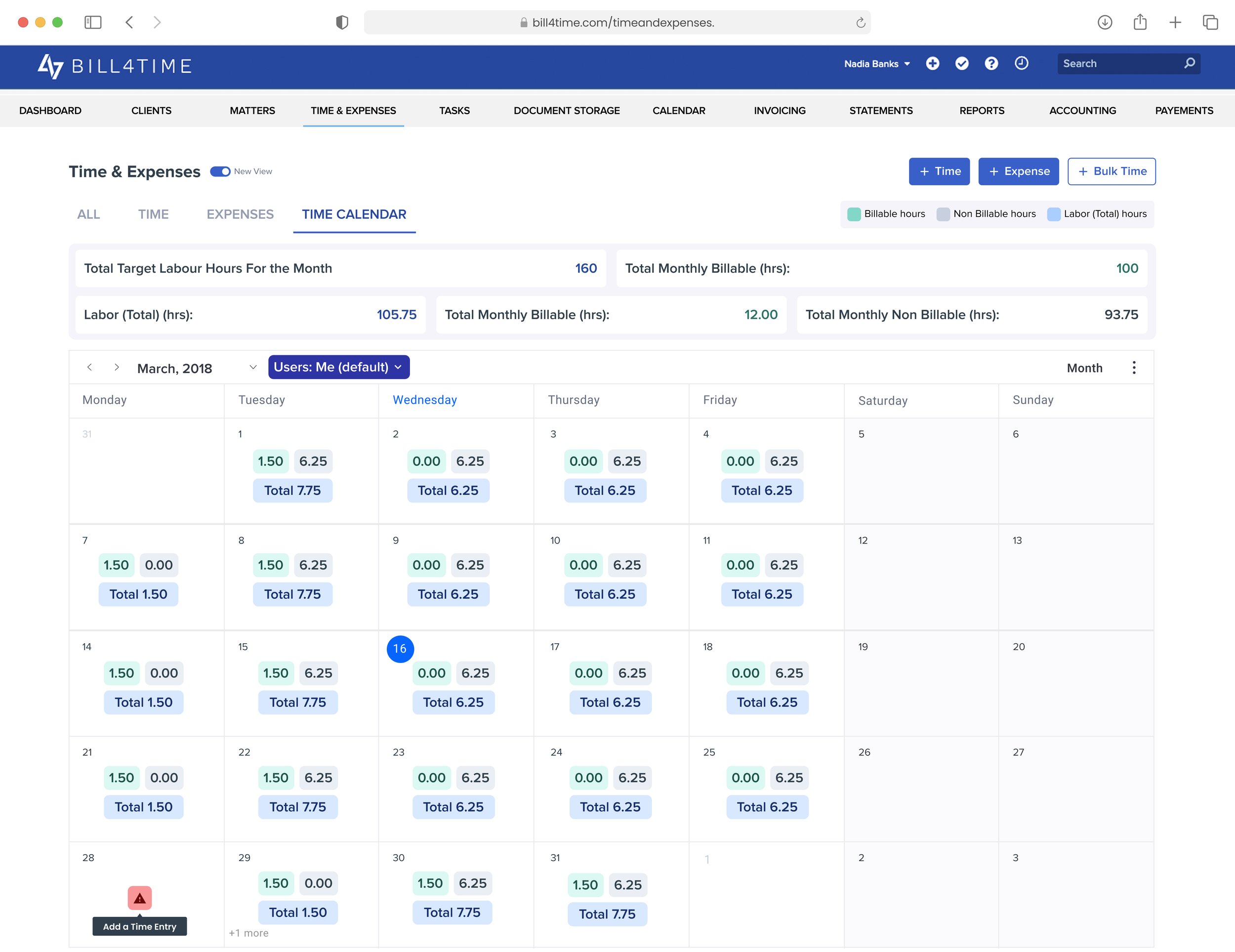
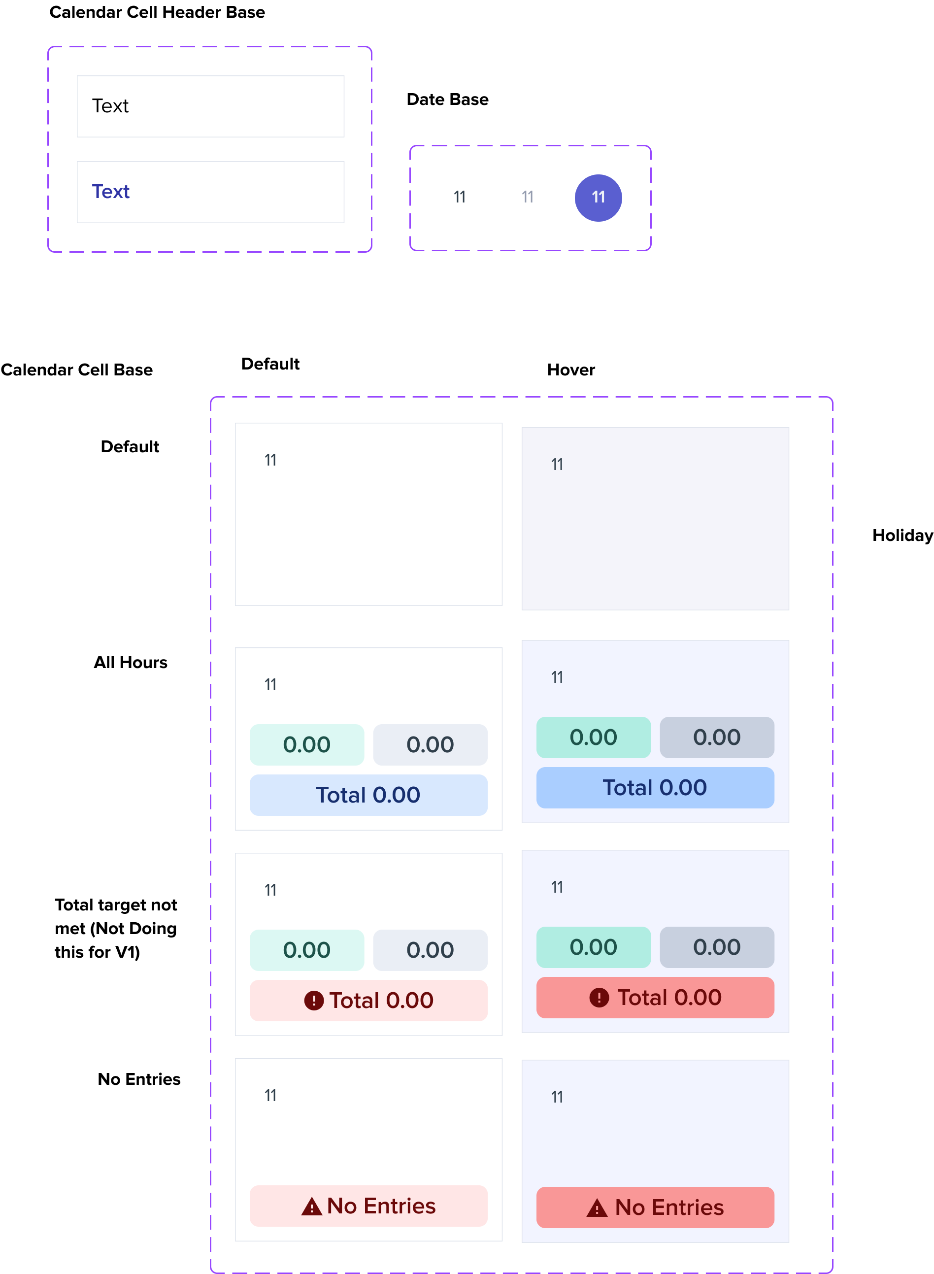
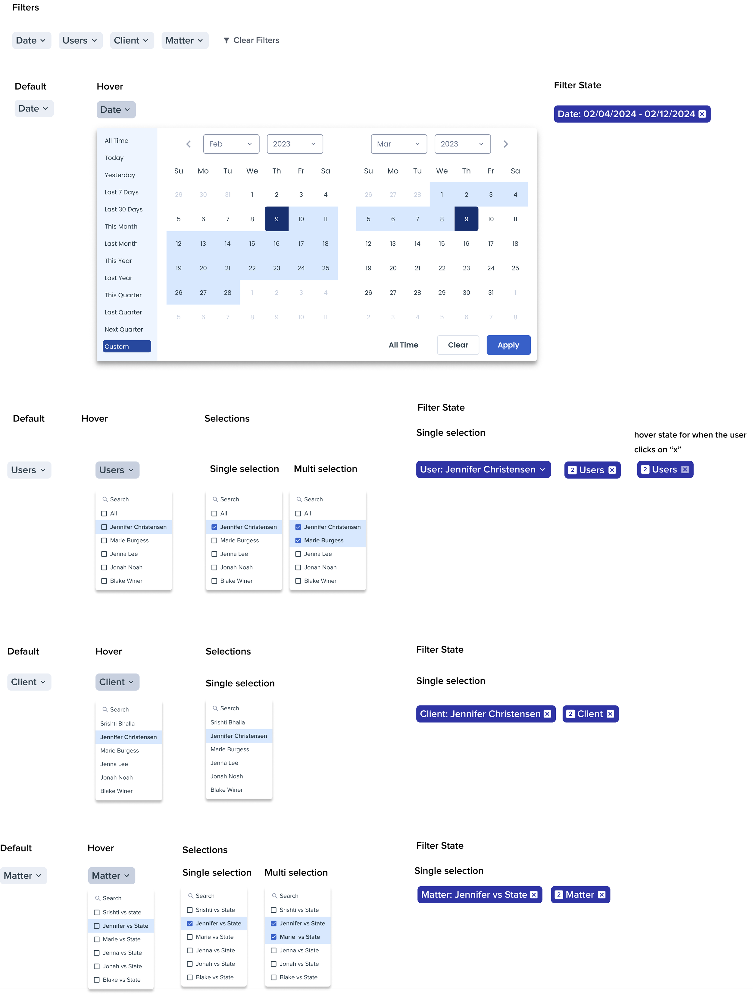
I led the redesign of Bill4Time's Time & Expense tracking system, introducing a monthly calendar view that gave lawyers clear visibility into their billable targets - a critical capability missing from the old weekly grid.
Scroll to explore